Design Systems
Create consistency at scale while reducing cognitive load

A Design System creates consistency across your product so users do not have to relearn how it works every time they move to a new screen.
For older adults, caregivers, and people experiencing cognitive change, predictable patterns are essential. When buttons shift, layouts change, or interactions behave differently, cognitive effort increases. That friction reduces confidence and trust.
We build design systems that unify structure and visual language. The result is a product that feels stable, clear, and easier to use, while also helping your internal teams move faster and with less confusion.
A strong design system supports users and strengthens your organization.
When to invest in a Design System
This service is especially valuable when:
Your product feels inconsistent across screens
Patterns vary depending on who designed them
Older adults struggle with changing layouts or behaviors
You are scaling and need accessibility to remain intact
Development slows due to unclear assets or specifications
You are planning a redesign or visual refresh
Multiple teams or contractors contribute to the interface
Accessibility gaps are appearing as the product grows
If your product is expanding but consistency is slipping, a design system creates stability.
Outcomes you can expect
A Design System helps you:
Reduce cognitive load through predictable patterns
Improve user confidence and orientation
Increase task completion through consistency
Speed up design and development cycles
Reduce rework and duplicated effort
Maintain accessibility as features scale
Align cross-functional teams around shared standards
This is about clarity strengthened, efficiency improved, and usability protected.
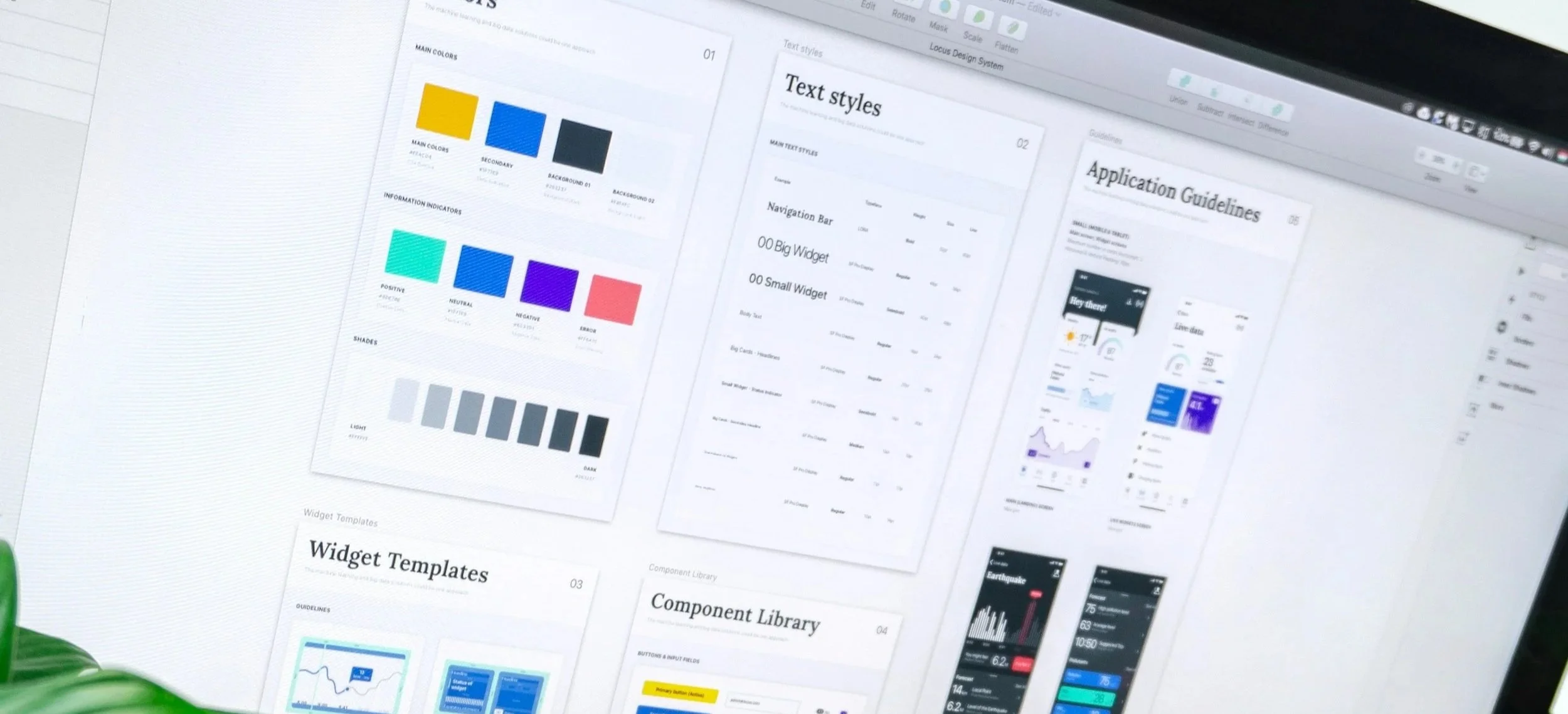
What a strong Design Dystem includes
A well-built system integrates structure, visuals, and interaction standards.
Component Library
Reusable UI components that are:
Clear and readable
Consistent in behavior
Predictable across contexts
Efficient for engineering to implement
Each component is designed to reduce memory strain and decision fatigue.
Visual Foundations
Core visual standards that define:
Accessible color systems and contrast usage
Readable typography and hierarchy
Spacing rules that prevent clutter
Layout structures that support orientation
Imagery and iconography guidelines
These foundations ensure the experience feels calm and cohesive.
Usage and Interaction Guidelines
Clear documentation explaining:
When and where to use each component
How elements work together
Expected interaction behavior
How to maintain consistency as the product evolves
This protects predictability, which is critical for users with cognitive variability.
What it’s like to work with Slide UX
We work closely with product, design, and engineering teams to build systems that are practical and usable, not theoretical. We explain standards in plain language and connect them directly to user cognition and operational efficiency.
Our approach balances structure with flexibility. The system feels manageable, not overwhelming.
Our goal is to help your organization move faster while making the experience clearer for the people who depend on it.
Engagement options
A complete design system build, including components, visual foundations, and documentation.
A focused sprint to create or refine key components and standards.
Continuous updates and expansion as your product grows.
Start the conversation
If you want a consistent, scalable, and cognitively supportive foundation for your product, we are ready to help. Contact us and we will get you started.