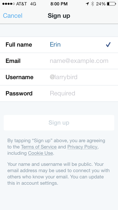
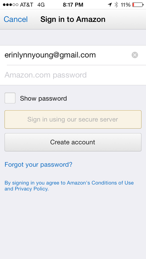
While iterating on a mobile app redesign this week, a discussion emerged about the pros and cons of disabling a form's "submit" button.
Disabling a button prior to completion of required fields is meant to prevent a negative interaction - waiting for form validation only to receive an error message.
Unfortunately, a disabled button can't easily explain WHY it's disabled. A mouseover or onClick/onTap interaction can offer an explanation, but users don't know to expect either.
The question becomes, which is more frustrating — a disabled button, or a form that returns an error?
An article from 2012 entitled Who killed the inactive button state? makes the argument that disabling buttons is just as bad as returning errors. The author contrasts OSX's Activity Monitor against iTunes.
However, that thinking doesn't align with the trend we see across popular mobile apps for iOS.
It's hard to agree with the author's stance when so many popular apps have adopted the disabled button pattern. And there's also something to be said for case-by-case consideration.
But we've never had the opportunity to test this particular interaction and would love to know — is a disabled button a useful or troublesome cue?


