When launching a new company or product, logo design should be one of the first things you consider in your marketing toolkit. A well designed and impactful logo gives your company or product an identity of its own at a glance, and can set your company or product apart from competitors in the same field.
There are typically three styles of logos that companies and product teams use to distinguish themselves:
A stylized type treatment, or “wordmark”
A “mark” or small image that helps tell consumers what your new offering is all about.
The hybrid, a little of #1 and #2
Each of these two logo types have their pros and cons when used to communicate identity.
1. The type logo

NASA has its wonderfully stylized “worm” logo where each letter flows into the next. Ikea frames their type in bold shapes.
Sure, Google could have done some intricate type customization, but in their case, rendering the letters of the word Google in different colors provides a simple yet incredibly memorable logo that consumers remember.
Let’s dive into the first type: the type treatment, sometimes called a “wordmark”. Type logos use text only to communicate your brand, such as NASA, Exxon, or Ikea. While some type treatment logos use off-the-shelf fonts for their creation, often times a designer will customize fonts to add that extra flair of identity. Thinking of the examples mentioned above, NASA has its wonderfully stylized “worm” logo where each letter flows into the next. Exxon also uses some extra customization by overlapping the X’s in its logo to make itself memorable in consumers minds.
Companies and product teams sometimes gravitate towards usage of type treatment logos because they are simpler for consumers to identify, and easier to design in most cases, saving money in the design process. Type treatment logos also offer a limited scope of possible customization.
2. The mark logo
Single marks can be icon, but very hard to get right.
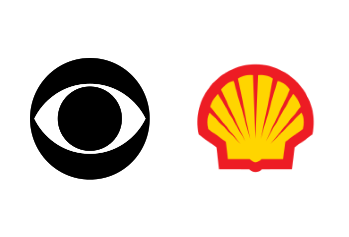
The second type of logo, the mark, is what most consumers typically think of when they hear the word “logo.” A mark is just what it sounds like, a type of glyph or drawing that isn’t rooted in typography. Some more well known marks include the CBS eye logo, Apple’s apple mark with a bite taken out, and Shell Gasoline’s iconic yellow and red shell.
A well designed mark can sometimes even transcend its use as only being a logo, and can stretch to become a character for the brand itself such as the Michelin Man.
“Marks are actually harder to design than type logos. Simple is never easy.”
Companies and product teams looking for a new logo will typically pick marks over type treatment logos if they want something more customized, identifiable (especially for non-native language speakers), or complex than a type treatment can provide to set their brand apart. Logo marks also tend to have longer lifespans and better consumer adoption in a broad range of marketing or promotions, such as stickers (looking at you Apple), or tee-shirt designs.
Marks do have some drawbacks as well. A mark will almost always take much more additional design time over a type logo to create, as they are more complex to design, and more important to get right feeling or aesthetic. Similar to how a simpler type logo can be changed in a limited way to customize itself, a mark logo can include those same customizations types, and can also include more opportunities for customization depending on context and intended usage.
3. The hybrid logo
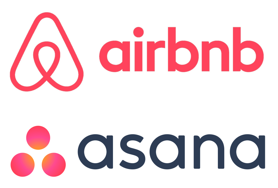
Modern brands, especially tech startups, have recognized the value of combining the mark and type into a single “lockup”. With the two working together, neither one has to try as hard to differentiate an emerging brand. The type offers a clear and friendly introduction to a new brand, while the mark adds flair and a visual identity useful in social and product contexts. In the hybrid approach, the type is usually a simpler style that it would be if it were the whole logo. It complements the complexity of the
How do you choose?
In my experience, regardless of the way a company or product team goes in their quest for a new logo, there are some very important things to consider to make sure they get exactly what they need while using their budget wisely.
Keep in mind how the new logo will be used. Will it be high in the sky on a billboard in Times Square? Finer details of a logo at this distance might be hard to see. Will it be used in business correspondence for things like business cards, or a company letterhead? In these cases a logo should be able to work at very small sizes but still be able to be recognized easily. What about if it only appear in digital format online for a website or banner ads? Just make sure that the colors used don’t create any sort of digital “artifacting” or pixelation between color, especially if it includes any sort of gradient. Will it be used in greyscale for newspaper or other limited color advertisements? Ensure your logo has enough contrast to be easy to distinguish against the rest of the page.
At the end of the day, every company or product team wants to employ a considered, well-crafted logo to draw consumers to their product and create brand recognition. These teams should keep in mind however, not all logos are created equally, and often it takes considerable time, talent, and effort to get to the end of the tunnel with an effective and smart logo design.