We’ve been on a prototyping binge recently and while working with dynamic panels we learned a neat trick that we thought we’d share.
In one situation, we were designing a page with a vertical list of widgets each with different panel states. We wanted any widgets below to dynamically Push/Pull to allow for the varying heights of offpage panels.
What we found was that even though we configured all the widgets with Push/Pull, because the size of the dynamic panel matched that of its first state, longer subsequent states were cut off - and the widgets weren't pushing and pulling as we'd intended.
The solution to allowing the widgets below to Push/Pull AND display the full content of taller panels was the Fit to Content feature. This feature solves a very common use case and can be difficult to find in the application.
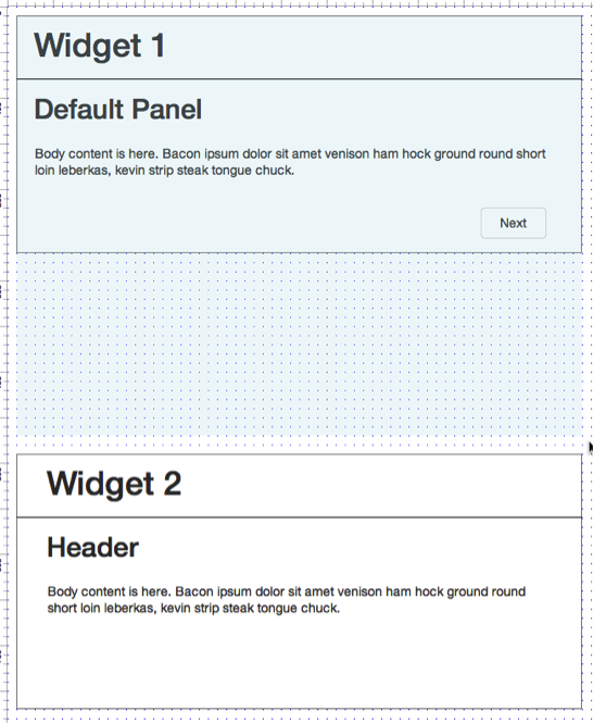
Here we have two widgets stacked on a page.
This image shows the widgets stacked on the page.
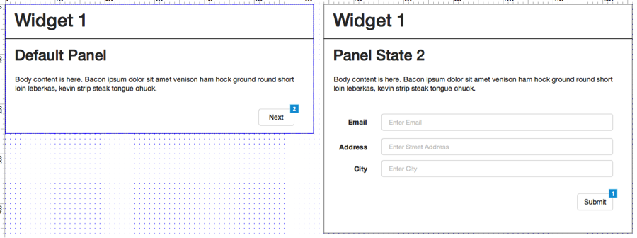
On Widget 1, a user was expected to read messaging on State 1 before selecting “Next” to get to a form on State 2 making the secondary panel longer than the default panel.
The two dynamic panes side by side to show the height difference of Panel State 2 versus the Default Panel. In our prototype content on Panel State 2 was being cut off at the height of the Default Panel.
When adding the OnClick case to the “Next” button we pointed it to State 2 and enabled the Push/Pull Widgets Below option.However, when previewed, the widgets DIDN’T Push/Pull!
The OnClick configuration of the Next button on Widget 1 State 1 clearly shows we configured Push/Pull.
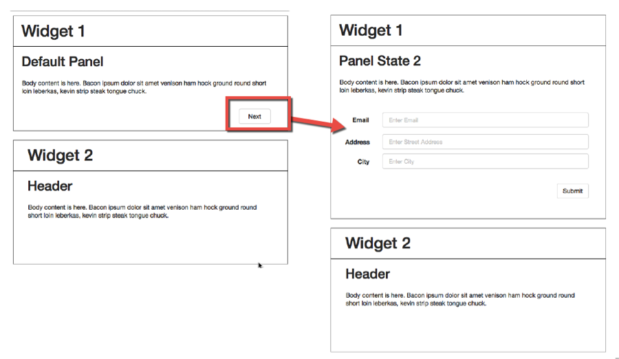
What we found was that when previewed, State 2 of Widget 1 was being cut off by Widget 2.
Widget 2 is overlapping the content in Widget 1 State 2 instead of Pushing/Pulling as expected.
We could have worked around this by adding white space between the two widgets and dragging the dynamic panel mask down to allocate the necessary space for State 2. This isn’t ideal since we’ve configured the whole Push/Pull interaction and that’s what we want dag-nabit.
An inelegant solution adds white space to account for Widget 1 State 2 height.
The elegant solution lies in a simple right click. With the mask selected, right click and select “Fit to Content.”
The magical solution in the right-click menu: Fit to Content.
Now preview your masterpiece and voilà! We have created a truly dynamic prototype where the main page responds to the height of dynamic panels off the page.
The desired Push/Pull of Widget 2 when viewing Widget 1 State 2.
TL;DR: Watch our video summary of the issue and how we implemented the solution.
Axure tip for using the Fit to Content menu item.


